

KitchenCheck - Reduce Waste From Your Own Kitchen
Household food waste is a huge problem in the United States. 40% of the food supply is wasted in the U.S., equaling more than 20 pounds of food per person per month.
I wanted to make a tool that helped everyday consumers keep better track of their groceries and use them up at home, to reduce food waste and save money.
Goal: Develop a mobile app to help consumers track their groceries and provide useful information to use them up and reduce food waste in their own kitchen.
Role: I was the sole UX/UI and Visual designer, responsible for user research, interaction design, user testing, wireframing, prototyping, UI design, and logo/brand design.
Research
My goal for the research phase were to gain an understanding of the other organizations and competitors in the space trying to tackle the issue of household food waste. I also wanted to gain an understanding of how consumers keep track of what's in their kitchen, their pain points in trying to cook or use up what they have, and their needs for reducing waste.
Methodologies

From the research and user interviews, several common themes emerged for consumers' pain points and needs.

I used those to create a persona, and to create an affinity mapping exercise to determine the core features of the app.
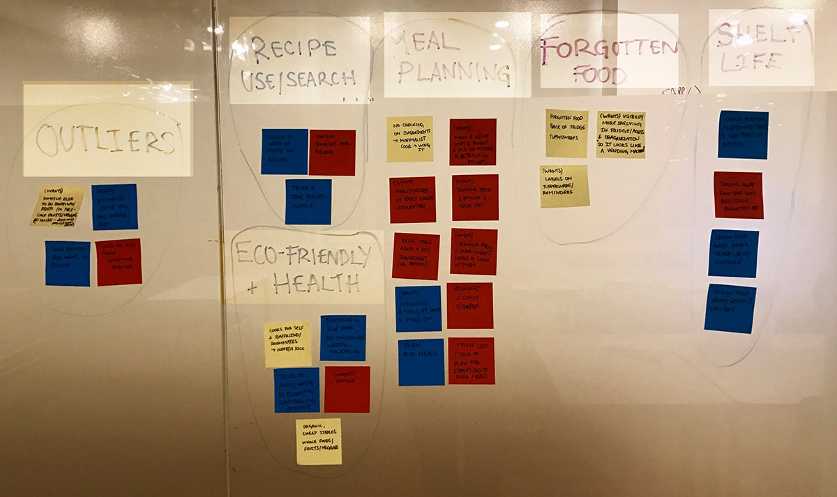
Affinity Mapping
For this exercise, I wanted to establish the main needs of the users so that I could start mapping out and prioritizing the app's features. I did this by mapping the users' needs on post it's and grouping them together into categories.
Feature Prioritization
Once I established the app's features from the user needs, I mapped them on a matrix to determine which should take first priority and which could be added into the app later. The most important features centered on scanning and tracking groceries, and providing easy ways to make use of them.

Application Map
Using the top priority features, I created a sitemap that would incorporate the high priority features of scanning groceries, tracking their amounts and expiration dates, and providing recipes using grocery ingredients for the users.

User Flow
A key piece in the process was mapping out the main tasks that the user would take and how they would flow from one section of the application to another. This flow visualizes the user's core task of scanning their groceries to their kitchen inventory, finding a recipe to cook with using ingredient filters, and then tracking what's left by updating their kitchen inventory list.

Wireframes
I first sketched out my wireframes on paper before creating digital versions of them.

Prototype and Test
The desktop prototype was tested with 5 users in person and through click tests online as well. My objective was to see how intuitive the designs were and if users would be able to complete the core tasks of scanning a grocery receipt, searching for a recipe using ingredient filters, and updating their kitchen inventory after using up ingredients.
Seeing how users interacted with the prototype made it clear where the flow was user-friendly, and where it needed tweaking. Using the feedback from those tests, I was able to produce a set of finalized wireframes.
Visual Design
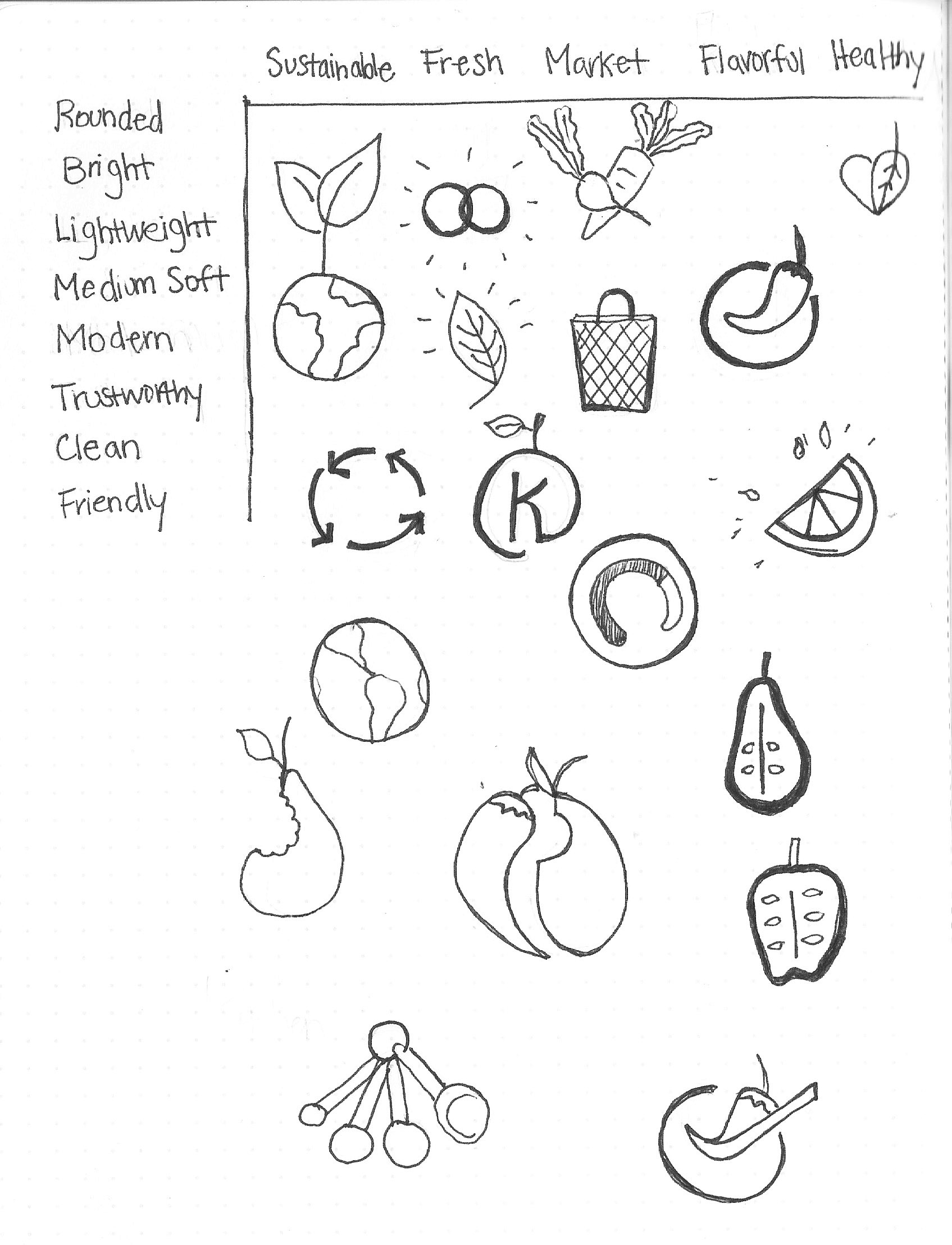
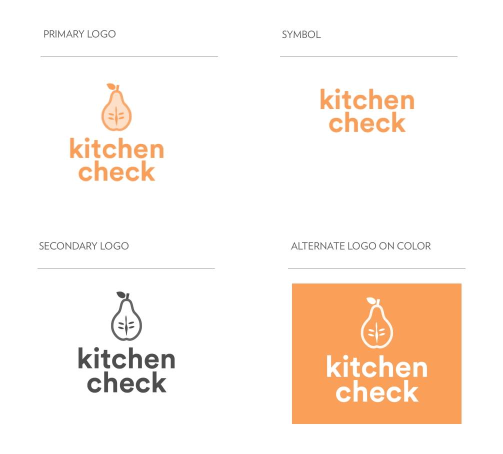
To define the visual style for the brand and user interface, I created a moodboard of styles, colors, and imagery. To brainstorm for the logo design, I created a matrix of key words that reflect the app's sustainable and eco-friendly mission, along with adjectives that support the feeling I wanted the brand to give off. I used this matrix to draw 5 symbols that I would associate to those words, that could be used in the logo.

Style Tile
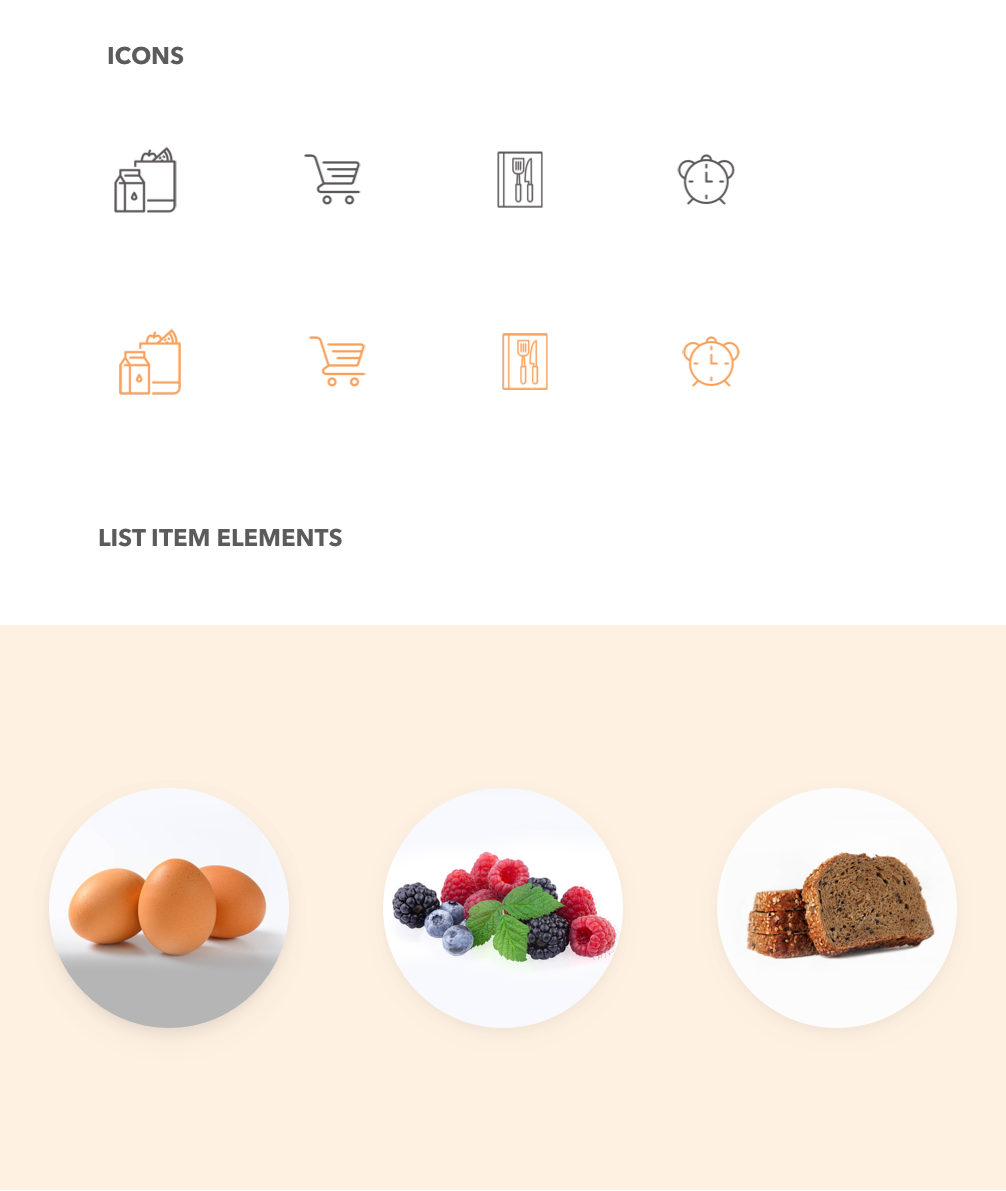
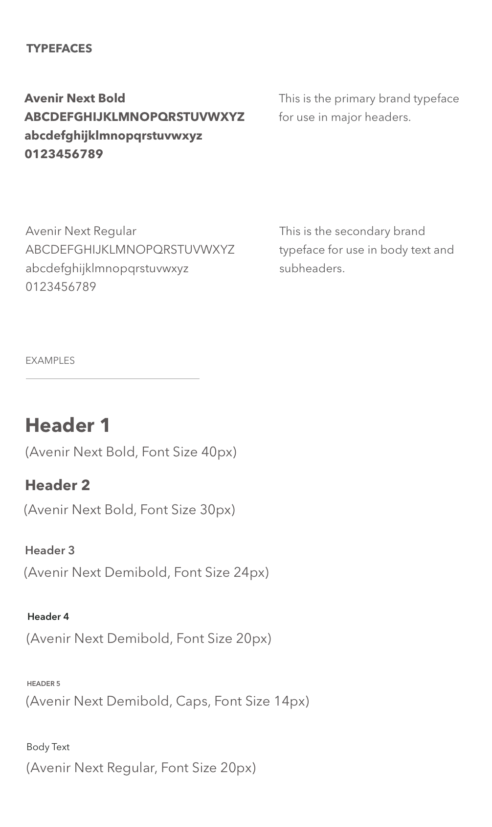
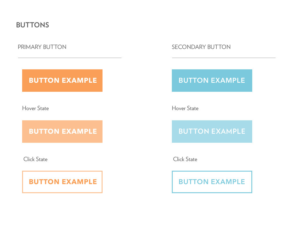
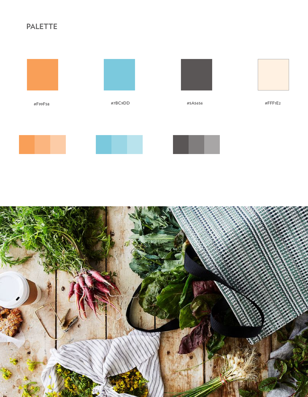
Once the logo was finalized, I created a style tile that defined the primary color palette, typefaces, text and button styles, icons, and other interface elements needed for the application.
User Interface Design
After the visual style was defined, I applied it to the user interface, ensuring the type, icons, image styling and layouts were consistent and evoked a bright, friendly, modern "eco" aesthetic.
Final Screens - High Fidelity Mockups
I defined the onboarding flow with high fidelity images and icons to prime the user for accessing their phone's camera for grocery scanning, and to walk the user through the main features of the app.
Key Screens
These screens include some of the app's core features like grocery receipt scanning, grocery list details, recipes with ingredient filters, and kitchen inventory tracking.

Final User Testing
After applying the final UI, I created a high fidelity prototype and tested it with 3 more users in person, along with 3 click tests on Usability Hub.
See the final prototype in action:
Summary& Next Steps
Going through the process from research to wireframes to final iterations taught me a lot about what everyday users would need in order to really reduce their food waste and feel good about it. To continue this project, I would continue building out the app and testing it with users so that I could continue to improve on it's features and functions. I would also start implementing some of my "next" and "later" features to improve the apps functionality and make it more robust.