
Mirror - Clothing Retail for Everyone
Mirror is a global chain clothing store with "clothing for everyone". The brand has been successful, global brick & mortar clothing retailer for decades and focuses on affordable but high quality clothing, with a wide range of selection for women, men & children.
Problem: Mirror has a limited web presence and is looking to grow it’s revenue by tapping into the big revenue opportunity of online shopping.
Goal: To address Mirror's needs, my goal was to develop a responsive ecommerce site that is easy and intuitive to use, and to modernize it’s brand with a new logo & style guidelines.
Role: I was the sole UX designer, responsible for user research, interaction design, user testing, wireframing, prototyping, UI design, and logo/brand design.
This project was completed as part of a Designlab capstone project.
Research
To start off, I created a timeline and research plan that detailed my strategy for the project. The plan included both qualitative and quantitative research methods to better understand the existing market and the needs of the target audience.
Methodologies
Secondary Research
Competitive analysis
5 User Interviews
From the research, two types of people emerged. Those that planned ahead to shop around online, and those that didn't. The people that didn't plan ahead found online clothing shopping more time-consuming overall than going to the store because they would have to take into account the lead time for shipping. However, those who thought ahead were able to reduce the active shopping time by using an online platform, having more down time to spend as they wished.
I chose to focus on those "planners" who would actually use the online shopping site. They valued quick and easy checkout and return processes, and seeing accurate photos and descriptions of the products. From these interviews, my persona of Dev took form.

Using my research findings and data from user interviews, I distilled the users' insights into common themes to create an empathy map.

Interaction Design
Card Sorting
To start off the Information Architecture process, I used an online card sorting exercise to gather further insight into how consumers categorize clothing items and styles. The matrix shows the sorting patterns.
Sitemap
I created a sitemap based on the card sorting and research findings. The sitemap shows the top level navigation all the way down through the product details page, and how each category connects in the larger hierarchy.
User Flow
A key piece in the process was mapping out the tasks that the user would take and how they would flow from one section of the site to another. The flow visualizes the user searching for and selecting a piece of clothing, and then completing the checkout process.

Wireframes
I first sketched out my wireframes on paper before creating digital versions of them. To create the responsive wireframes, I started with mobile and worked my way up to desktop.

The desktop screens were used as a lo-fi prototype to test the information architecture and flow.

Prototype and Test
The desktop prototype was tested with 5 users in person and through click tests online as well. My objective was to see how intuitive the designs were and if users would be able to complete key tasks like searching and navigating to a product details page, and completing the checkout process.
Seeing how users interacted with the prototypes made it clear where the flow was user-friendly, and where it needed tweaking.
Visual Design
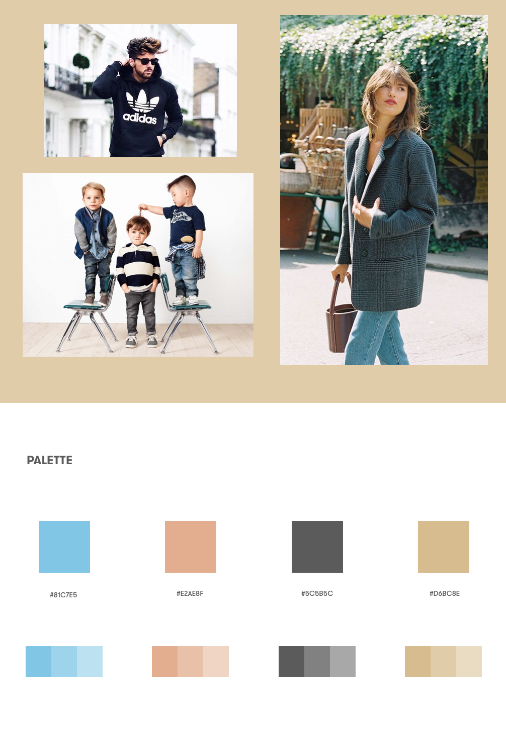
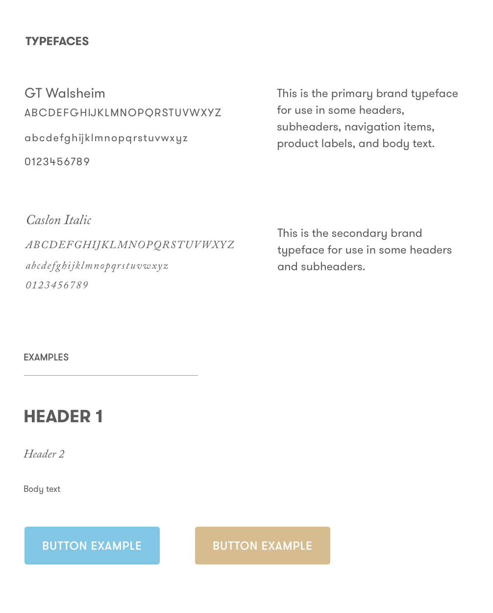
To define the visual style, I created a moodboard of the styles, colors, and imagery that the Mirror brand wanted to evoke. I then sketched out some options for a clean, modern logo, before moving on to create the style tile.


Style Tile

User Interface Design
After the visual style was defined, I applied the styling to the user interface, ensuring the fonts, image styling and layouts aligned and evoked the new clean, modern aesthetic that Mirror aimed to encapsulate.
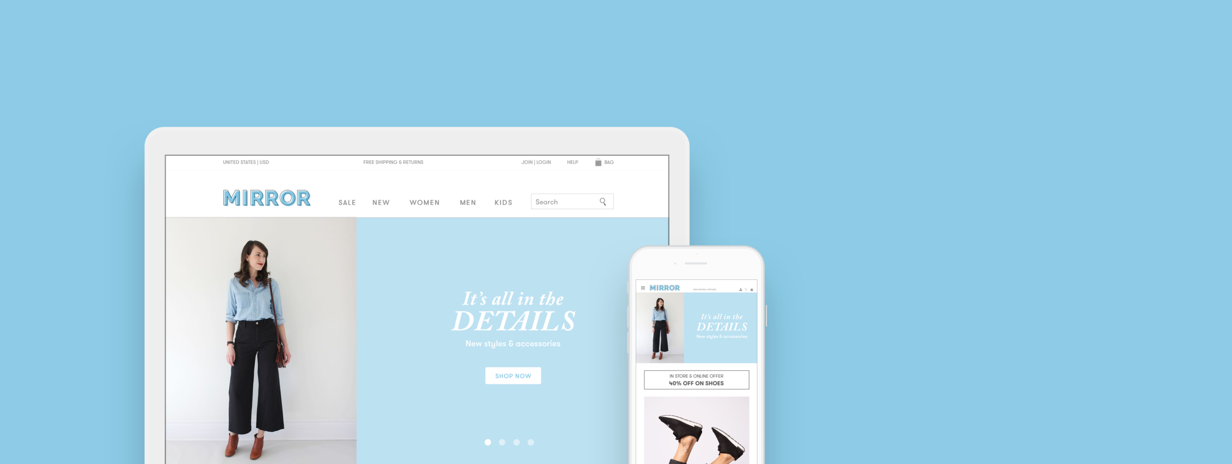
Final Screens - High Fidelity Mockups


Final User Testing
After applying the final UI, I created a high fidelity prototype and tested it with 3 users in person, along with a click test on Usability Hub.
See the final prototype in action:
Summary & Next Steps
Going through the process from research to wireframes to final iterations taught me a lot about what makes sense in an intuitive, user-friendly responsive ecommerce site. Next in the process would be developing wireframes for the rest of the site pages and user testing them. Once I have iterated on the design using my findings, I would apply the UI design to all pages and do a final round of testing.