

Condé Nast Travel - Trip Builder feature
Trip Builder is a new feature for the Condé Nast Travel app that allows Condé Nast Travel readers to plan trips. Though their content currently focuses only on travel guides, tips, and articles, they would like to incorporate the ability to plan a trip agenda through their mobile app. My role was to research, design and test all UX/UI related to this feature.
This project was completed as part of a Designlab capstone project.
Background
Condé Nast Traveler currently has a very limited mobile app that allows their subscribers to view copies of their print magazines. The company wanted to modernize the app and add functionality that gives their readers the ability to plan trips using their content--saving items from Condé Nast Traveler guides, saving travel articles, and more. This Trip Builder feature will allow Conde Nast readers to easily create personalized trips using Conde Nast content & recommendations.
Research
After receiving the brief, I created a timeline and research plan that detailed my strategy for the project. In order to better understand the target audience for this app, Condé Nast readers and frequent travelers, and how this product would best fit into their lives, I created a research plan that employed several research methodologies.
Methodologies
- Competitive analysis
- Market Survey of 20 users
- 3 User Interviews
Talking to potential users showed me what elements of travel planning they find most important, how they plan for trips, and what their pain points are. After completing the research, I created a summary of the 3 major needs and pain points for each user, and distilled the common themes across all users. I then created persona to encapsulate these findings within one user. My persona helped to personalize the data and insights that I collected during my research, and was also helpful to to refer back to when I encountered difficult design decisions later on in the project.

Interaction Design
Application Map
Using the data and insights from the research phase, I created an application map to figure out where the new Trip Builder feature would best fit into the existing platform and how it's Information Architecture would be structured.

Wireframes
I first sketched out my wireframes on paper, and then created digital lo-fi wireframes using Sketch to clarify the information hierarchy and key elements. These also served as the basis of the lo-fi prototype that I created to test the information architecture and element placement. I prefer to start out hand sketching potential solutions for the layout of the application and then from there build the lo-fi wireframes in Sketch where I can further iterate upon them.

Prototype and Test
The true test comes when the product is given to users to try. I created a prototype from my wireframes and tested it with 3 users in person and through click tests online as well. My objective was to see whether or not my design was intuitive and if users would be able to complete key tasks such as navigating from sign in to adding a listing, and looking at the listing map view.
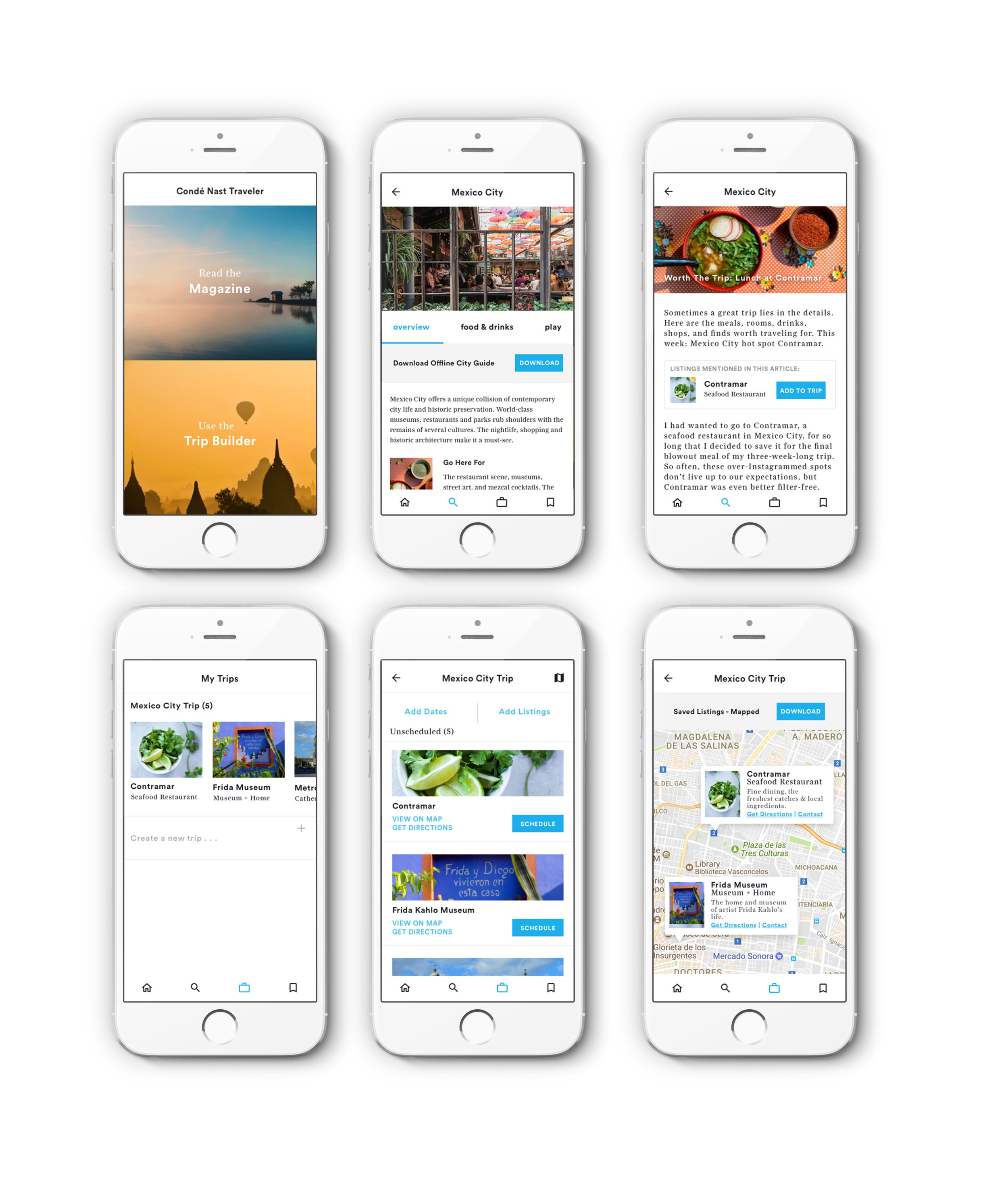
Some subjects had difficulty saving a listing from an article to their trip, so I revised the design by making the listings mentioned in an article more prominent on the top of the article page, with a save button, so that the "add item" action became clear and easy to use.

I retested with the revised prototype and had better results and more positive feedback. Users liked that all available listings to save were prominent and accessible at the top of the page, and that the steps needed to save a listing or and create new trip were decreased.
User Interface Design
Because the current Condé Nast Traveler app is quite limited, and shows the print version of the magazine without any real UI, I used Condé Nast's current web UI as a guide to create the app UI for the Trip Builder feature. The fonts, image styling and layouts were kept the same so that they would fit in seamlessly and align to the existing brand.
Final Screens - High Fidelity Mockups
Final User Testing
After applying the final UI, I created a high fidelity prototype and tested it with 3 users in person, along with a click test on Usability Hub. User testing proved that the final UX was intuitive for users, and the UI was recognizable and aligned with the existing Condé Nast brand.
Final prototype:
Summary & Next Steps
Going through the process from research to wireframes to final iterations taught me a lot about what makes sense in an intuitive, user-friendly travel planning mobile app. Learning how to integrate the features of a travel app into a publication app was challenging, but through user interviews and testing, it became clear that many travelers want the same things when planning their trips. I learned that having an easy way to save and access destinations on an offline map was very important to users. If I had more time, I would continue to research user needs and add functionality to the app. I would run a feature prioritization exercise to determine which features to add next, and then continue building out those features and testing them with users.